
Graphic design plays a role in capturing people’s attention, conveying information, and leaving an impression. Even the most experienced designers are not immune to making mistakes. Whether you’re a seasoned pro or just starting out, understanding common graphic design mistakes can help you elevate your projects and feel more confident.
So, let’s dive into the world of “design don’ts” and look at some simple ways to avoid graphic design mistakes. Remember that every mistake is a learning opportunity, and with this knowledge, you’ll be well on your way to creating powerful visuals!
Graphic design mistakes – Typography troubles
Avoid trying to include every cool font you find in your design. Too many fonts overload the visual space and make it difficult to read. Limit yourself to 2-3 complementary fonts, one for headings and another for body text (perhaps a third for accents). Think about harmony, not chaos!

Ensure that your text is readable at all viewing distances and platforms. Consider someone checking your flyer on the bus or your website on their mobile phone. Adjust font sizes accordingly, and avoid using too small text that strains the eyes.
Line spacing, letter spacing (kerning), and word spacing (tracking) are all important factors in visual appeal and readability. Unbalanced spacing makes text appear jumbled and unprofessional. Use design software and your sharp eye to achieve a well-balanced, pleasing flow.
Colour chaos
Colour choice affects the tone and mood of your design. While bright colours are appealing, avoid jarring combinations that lead viewers to squint. Learn about colour theory and tools like complementary palettes to create harmonious and effective colour schemes.
For best readability, make sure there is enough contrast between the text and background. Consider someone with visual impairments. Would they be able to easily understand your message? Test your design against various backgrounds and adjust the colours for clarity.
Black-and-white designs still exist! Don’t be afraid to use monochrome palettes to achieve a sophisticated and timeless look. Remember: sometimes less is more.
Composition calamity
A busy design confuses viewers and takes away from your message. Use white space wisely to allow elements to breathe and to guide the viewer’s eye through your design. Prioritise important information and reduce unneeded chaos.
Unevenly aligned elements indicate disorder and unprofessionalism. Grids, guides, and alignment tools can help you create an organised and balanced composition. Keeping consistency is important!
Visual hierarchy focuses viewers’ attention on the most important information. Use size, contrast, and placement to prioritise elements and make your message clear and impactful. Consider what you want viewers to see first, and design accordingly.
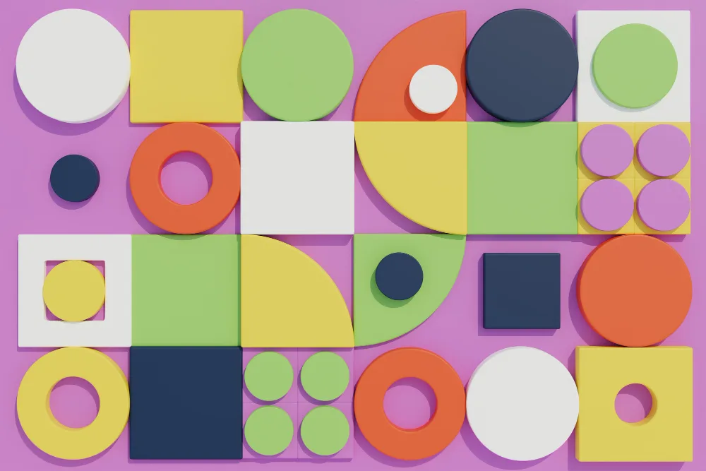
Image impasse
Low-resolution images look blurry and unprofessional. Always use high-quality images that are specifically designed for your preferred format and size. Remember that first impressions are important, and blurry visuals do not look good.
While stock photos can be useful, using clichés excessively can make your design feel generic. To stand out from the crowd, try creative alternatives such as custom photography, illustrations, or graphics.
Always ensure that you have the necessary licences and permissions before using any images in your designs. Copyright infringement can result in legal action, so be responsible and source your visuals ethically.
Proofreading panic
Even tiny graphic design mistakes may damage your professionalism. Proofread your designs carefully, looking for spelling, grammar, and punctuation mistakes. Consider using spell-checking software and asking a second set of eyes to review your work.
Double-check for any missing contact information, dates, or website addresses. Ensure that all information is correct, up-to-date, and relevant to your intended audience.
Think about the needs of users with disabilities. Use alt text for images, ensure adequate colour contrast, and select accessible fonts to make your designs inclusive and usable by everyone.
Graphic design mistakes are unavoidable, but with awareness and practice, you can avoid typical errors and create impactful, professional designs that connect with your target audience. Do not be afraid to experiment, learn from your mistakes, and, most importantly, enjoy the creative process!